
Some of the most difficult times running an ecommerce site can be when you’re trying to increase optimization and find usability tests to better serve your customers through AB testing. However, there is a starting place. Look at each of the sections of your web site to see if any of these tests an suit your needs. Remember to make sure the tests become statistically relevant by hitting a large enough audience of your visitors.
GLOBAL/CSS
- Test the colors of all your buttons
- Trial all of your “commerce buttons” as one color, and all other buttons as another
- Test global language like “Shop” versus “Shop Now”
- If two buttons exist next to each other, test one as the primary (filled-in) and one as the secondary action (ghosted/outlined)
- Add a hover state to your CTA or test the rollover state
- Test pop-ups versus bottom-0f-browser anchored subscription options
- Test 404 pgs with branding and company feel versus words and links only, for engagement and reduced bounce rate
- Test where the error message is seen (inside or underneath the field) on forms
- Test having Chat on the web site or not at all (many companies see a drop in phone sales when users chat versus call)
- Test your videos: auto-play versus click-to-play
- On subscription areas, try adding text that assures users you won’t fill up their inboxes with unnecessary junk
- Test the page load on various pages. Test image file sizes on heavy offenders to try and reduce bounce rate and increase engagement.
- Test global font size and other design elements for readability
- Test the arrangements/order of words. Example:
A. Get $25 off your first order.
B. Get an additional $25 off. Order now. - Test removing exclamation points in sales verbiage (many times they don’t work). Use statements instead.
- Test made-up words. Many times using a word that is brand-specific or made-up creates intrigue and increases clicks.
- Test modal pop-ups when the customer’s cursor leave the browser window
- Test a locked content grid versus a fluid, full-width one
- Test hyperlinks, not buttons, on tertiary stories

- Test where your country/language/currency/web site chooser is located

DIY eCommerce UX Audit
Download our FREE 117 point UX audit that you can apply to your own website.
HEADERS
- Try having the search box closed (expanding on hover) versus a static, always open box
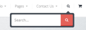
- Test the search box on the right versus the left of the browser
- Try testing “Add to Bag” versus “Add to Cart” language
- Similarly test a Cart icon versus a Bag icon in the header
- Test the wording of your value proposition in the header
- Try using a separate top-most header for account- and customer service-rated navigation
- Test a profile icon next to “Login” versus having none
- Test a scrolling value proposition or announcements versus a static one
NAVIGATION
- Test a visual menu versus a textual one (if there a only a few products)
- Try a mega menu versus columned or silo’d navigations
- Test “Find a Store” versus “Store Locator”
- Test the order of menu items across the header
- Test the order of subcategories in each main category
- Test a hamburger menu versus a “mini navigation” on mobile
- Test using imagery in your navigation versus none at all
- Trying putting extras in your navigation such as Gift Registry, Wishlist, etc
- Test the transitions used when hovering from one main category to another
- Consider testing the resulting page from top-level navigation: landing page or category grid page.
- Test sticky versus non-sticky navigation/header
- Test “mini-cart” buttons “cart” and “checkout” both going to the same cart page
FOOTERS
- Test having value propositions in the footer as well
- Try using social icons versus links
- Test having an additional newsletter signup form versus non in the footer
HOME PAGE
- Test a random hero image versus one-for-all to determine the best performing images
- Test one main static image vs a carousel
- Test an email collection modal on the home page versus having it on all first page visited except the home page — to increase engagement and storytelling on the home page
- Try testing a mini-grid of product images to showcase featured products
- Test your hero headlines
- Test showing prices on the main hero versus merely the product name or headline
- Test the image on the hero itself: models showing the product, the product itself, or the product in-use
- Test the position of the CTA on the hero
- Trial using UGC on the home page
- Show your social feed versus none at all
- Try testimonials versus marketing copy on the hero image
LANDING PAGES
- In landing page images, trial people using your product versus studio shots
- Test using visual cues, such as down arrows, to increase scroll depth
CATEGORY PAGES
- Test layout options (grid vs. horizontal)
- Try testing color swatches vs. small product images in different colors

- Use a short description underneath your product name to see if that helps shoppers from erroneously clicking
- Test a landing page for top-level product categories vs a grid wall that “shows all”
- Change the default sort by option to price low-high, or another method
- Try testing models versus lifestyle images versus studio shots on the grid wall
- Bonus: Test random images within the grid wall to be lifestyle images among other studio images
- See if “Adding to Wishlist” from category pages increases engagement and sign-ups
- Test Quick Buy / Quick Look overlays to reduce the path to purchase
- Test hiding Add to Compare options to see if they product significant AOV change or engagement
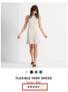
- Testing having aggregate star reviews under the product price:
- Test filter options and collapsable sections
- Test image rollover state to show other views (Caution: This could add page weight)
PRODUCT DETAIL PAGES
- Test buttons for sizes versus a drop down menu:

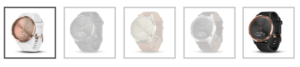
- Similarly, test the same with swatches/color names or images:
- Test tabbed descriptions and features sections versus showing everything on the page (without tabs)
- Test Sale price CSS: bold, red, etc.
- Test a form field for quantity versus a dropdown menu
- Test extra value propositions near the Add to Cart CTA:

- Test the size and font (and font weight) of the Product Name
- Test the location of the price: near the Product Name, below it, or closer to CTA
- Test product descriptions versus bulleted lists
- Test adding video descriptions on the page versus 360° views
- Test a lifestyle image on page load versus a lay-down or studio image
- Try using UGC in the product images versus in a separate section
- Test “New” or exclusive verbiage on page

CART
- Test having the coupon code on this page or not
- Test having multiple “continue shopping” buttons on the page: near the navigation and at the bottom near checkout CTAs.
- Test the option to edit/remove from the mini-cart
CHECKOUT
- Try testing the “guest checkout” and “sign in” order
- Try removing navigation from the checkout page to reduce abandonment
- Test a declarative statement for the coupon code field instead of assuming they have one — to reduce web searches for one. e.g. “Enter your code” versus “Do you have a coupon code?”
- Test having the marketing opt-in email box pre-ticked versus not
- Test the number of steps in the checkout
- Trial having address authentication versus none
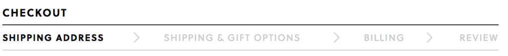
- Test showing the location of the customer in the funnel:
- Test radio buttons or drop downs versus icons for payment methods
- Test multiple options for “continuing” to next screen
- Try positioning most important information, such as email, at the top of the form
- Test position of policy links and warranties to ensure confidence:
- Test a more prominent location for customer service help/phone number
- Try showing a “review” of the customer’s cart even during the checkout process
- Test the placement and verbiage of the shipping information — when products ship, how fast, etc.
- Consider showing company values on the checkout page, and test their placement:

OTHER
- Test the length of your mobile web pages. Are mobile users more willing to click to a new page or scroll down a page when browsing your site on their device?
- Try different displays and navigations options.
- Test simple versus multi-step forms
Finding ways to incrementally improve your site will result in happier consumers, better conversion and ultimately more revenue.
Need help with onsite optimization, implementing Google Optimize or Optimizely, or running some tests? Elevar is the perfect companion to your testing process. Book a demo today!
DIY eCommerce UX Audit
Download our FREE 117 point UX audit that you can apply to your own website.
Thank you, Kyle! Really inspiring info! Would be more persuasive for readers just to see some results from the experiments like this. Are they any results you can share with us?
Nice and good knowledgeable site and articles…