3 Ways To Optimize Product Option Selections on Product Detail Pages
3 proven ways to optimize your product option selections on product detail pages
Brad Redding
Brad Redding is the Founder & CEO of Elevar. Specializing in analytics, tracking, GTM, and conversion optimization.
With this post I’m focusing on designing product detail page options block to make the decision easier on the user.
If you’ve done any research on this topic, you may have encountered the grocery store jams experiment:
There were two stalls selling jam (aka the jelly of peanut butter & jelly!):
- one with 6 options
- one with 24 options
In this study, those presented with 24 different flavors of jams purchased only 3% of the time (not ideal).
Compared to the group given only 6 options: they purchased 30% of the time.
This study shows that as the number of choices increases, the ability to choose actually – any maybe counterintuitively – decreases (enter decision paralysis).
Makes sense, right?
So how can you apply this to your store?
UX Improvement # 1: Limit Options
Limit the number of options you show to new users or paid traffic being sent to a specific product page.
For certain products, such as makeup, being able to select a very specific shade or color can be a good thing and cater to more visitors.
However, in some cases, presenting 19 different shoe colors to a new visitor can be overwhelming and may lead to a quick exit.
A similar, but less prohibitive example of this is to show only a certain number of default options, giving the user the ability to ‘view more.’
Referencing the study above, a good test may be to show 6 or fewer initial options.
Wayfair employs this strategy today.
It wouldn’t be a far fetched guess that +80% of their product revenue comes from the 5 colors they show by default in the image below.
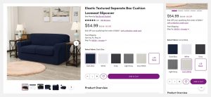
Rather than overwhelming the visitor with 19 other colors, from Coral Pink to Dark Cyan, they present their core colors and give the visitor the option of looking for another less-popular color.
You can see this in action with another one of our customers, Kinsley Armelle, where we tested multiple variations of color selector options.
UX Improvement # 2: Design Hierarchy
Organizing your product options into hierarchical groups can allow for easier scannability.
One way to accomplish this is to separate the options by ‘best sellers’, ‘classics’, or ‘limited edition.’
This not only helps with usability and scannability, but also provides a visual cue for new customers who may be looking for a bit of guidance on which variant or color to select.
Take a look at this example from Everlane:
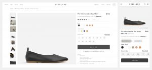
Indicating the best selling or limited edition colors might give a new user the reassurance that they’re in good company by choosing one of those options.
UX Improvement # 3
One last element to consider is the style of selector:
- Radio buttons (or single-selection buttons) allow a user to see and compare all options available – which can be especially important for sized variants
- Dropdowns provide a default option, and aren’t effective at giving a clue to the other options
Here are these two styles compared to one another:
This strategy is not only about optimization, but also about validation.
Unlike some tests that are very specific to a moment in time, such as:
- sale messaging
- headline copy, or
- promoting a new release
This PDP selector feature is something that gets high traffic every day.
If you have this on your website, chances are this section was designed with some UX consideration but never fully tested into.
Ensuring you have such a crucial section of the website highly optimized can fruit positive returns for a long time.
I hope this was helpful in sparking ideas of how to optimize your own product pages.
Have any questions? Please let me know in the comments!


Leave a Reply